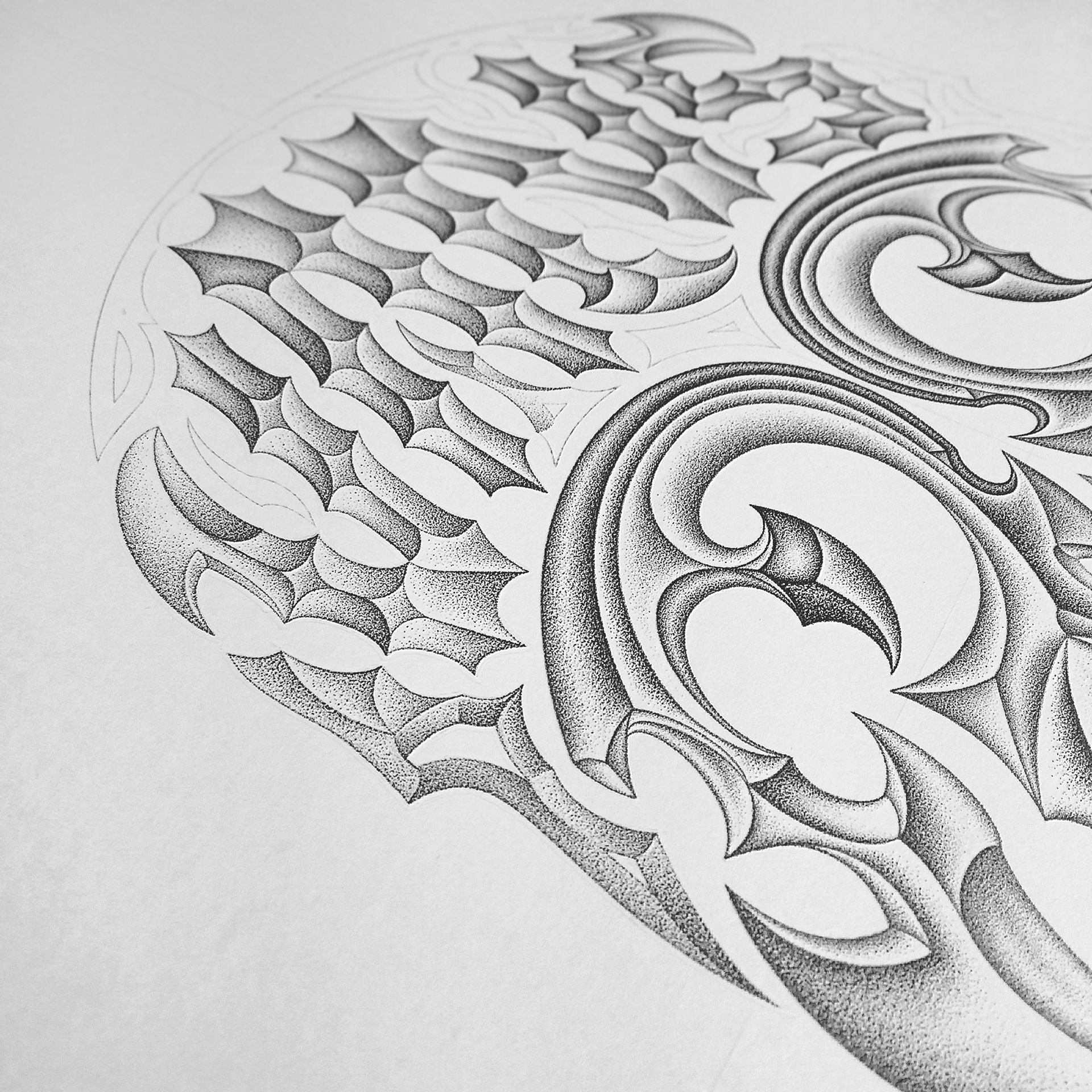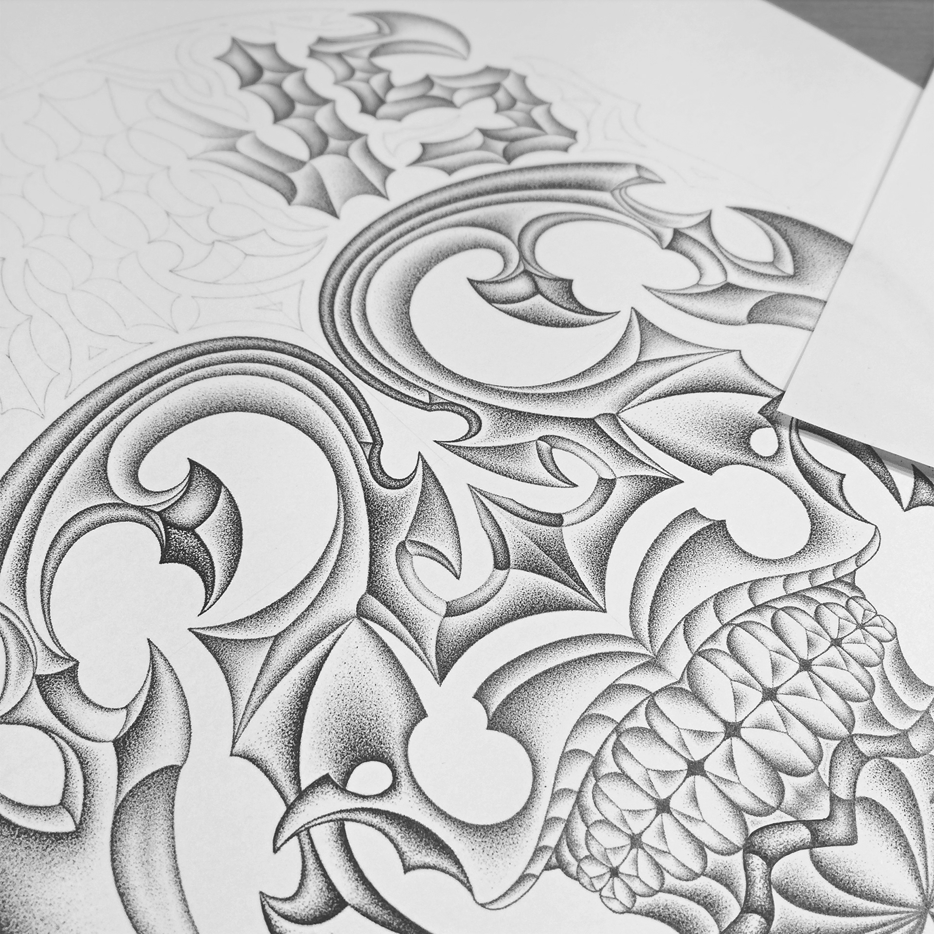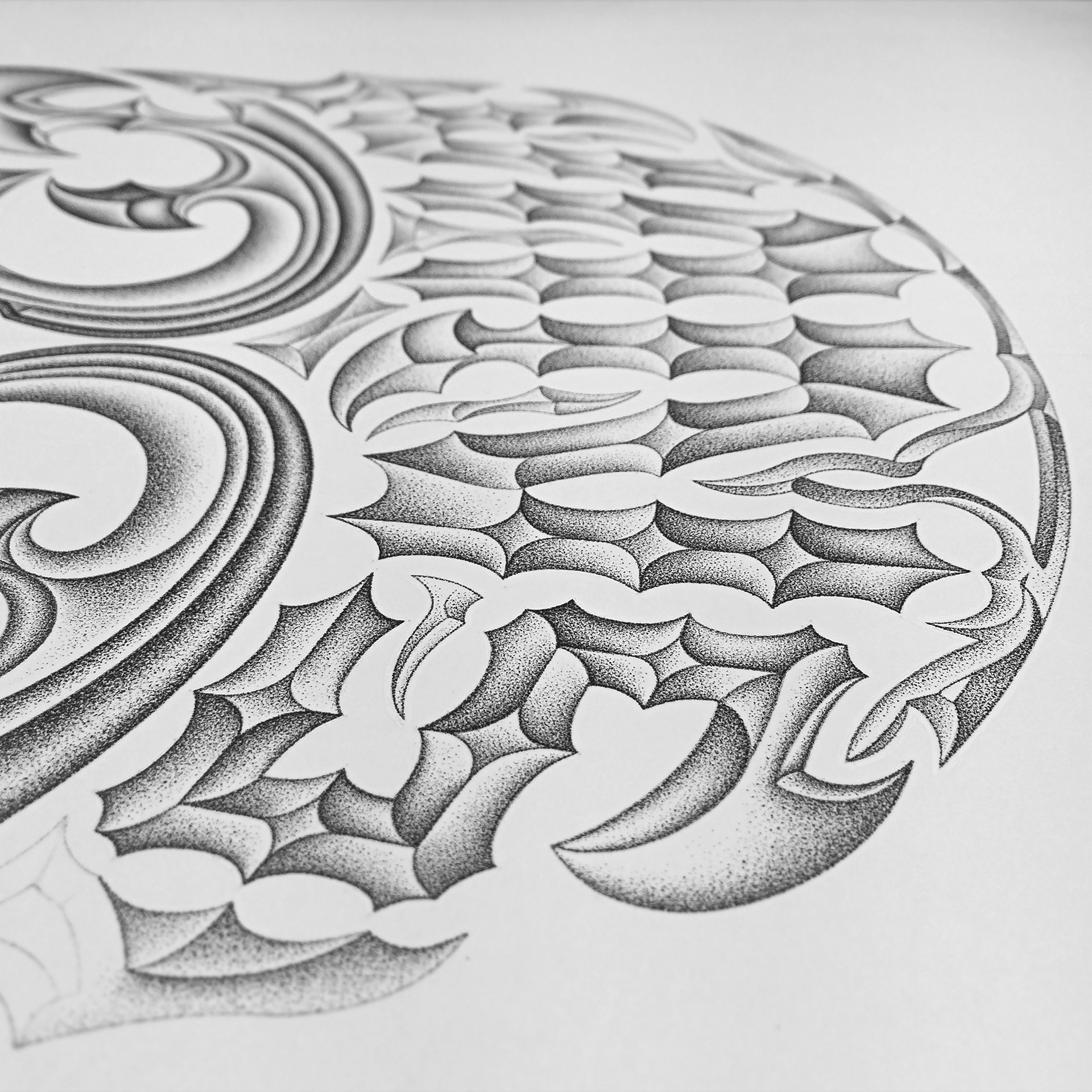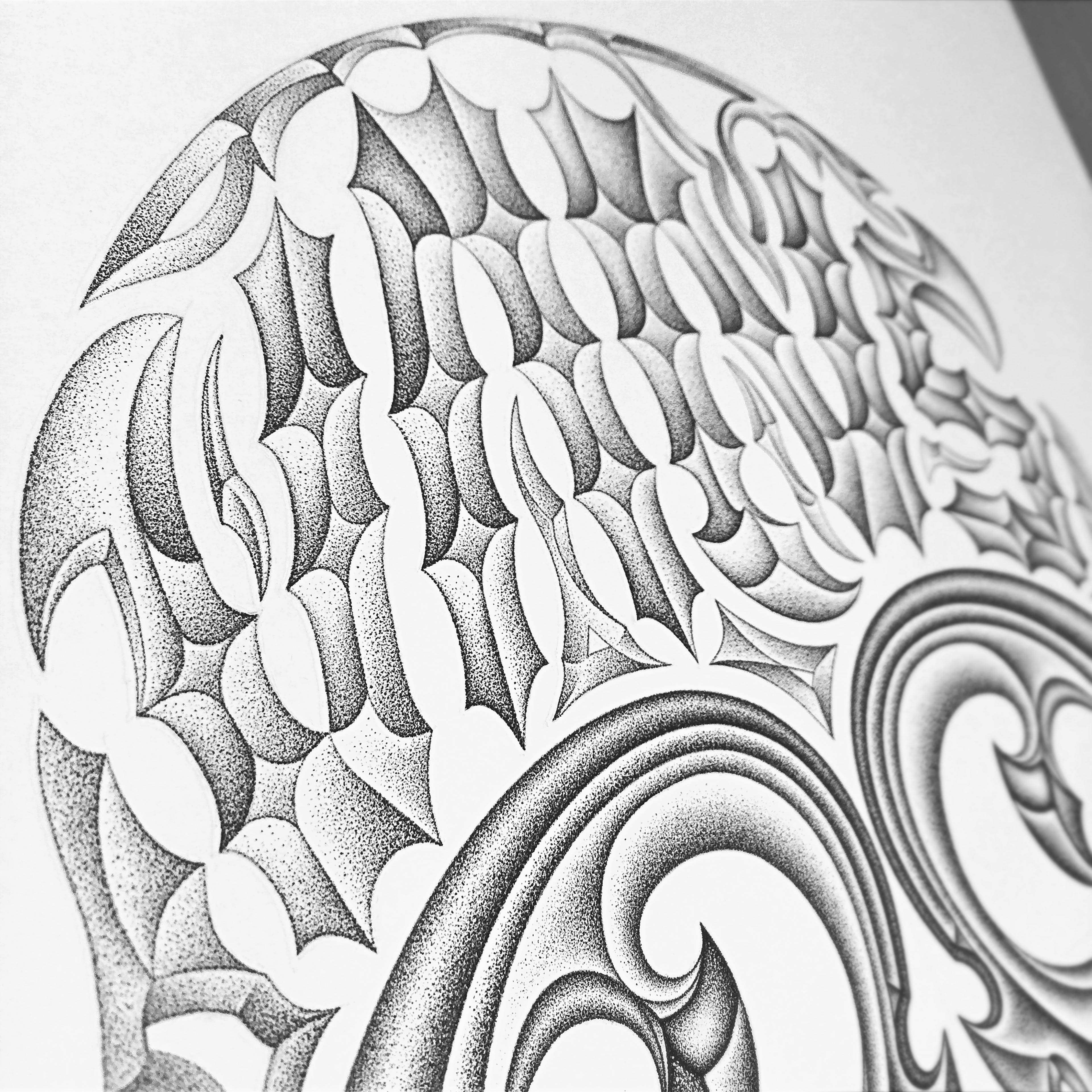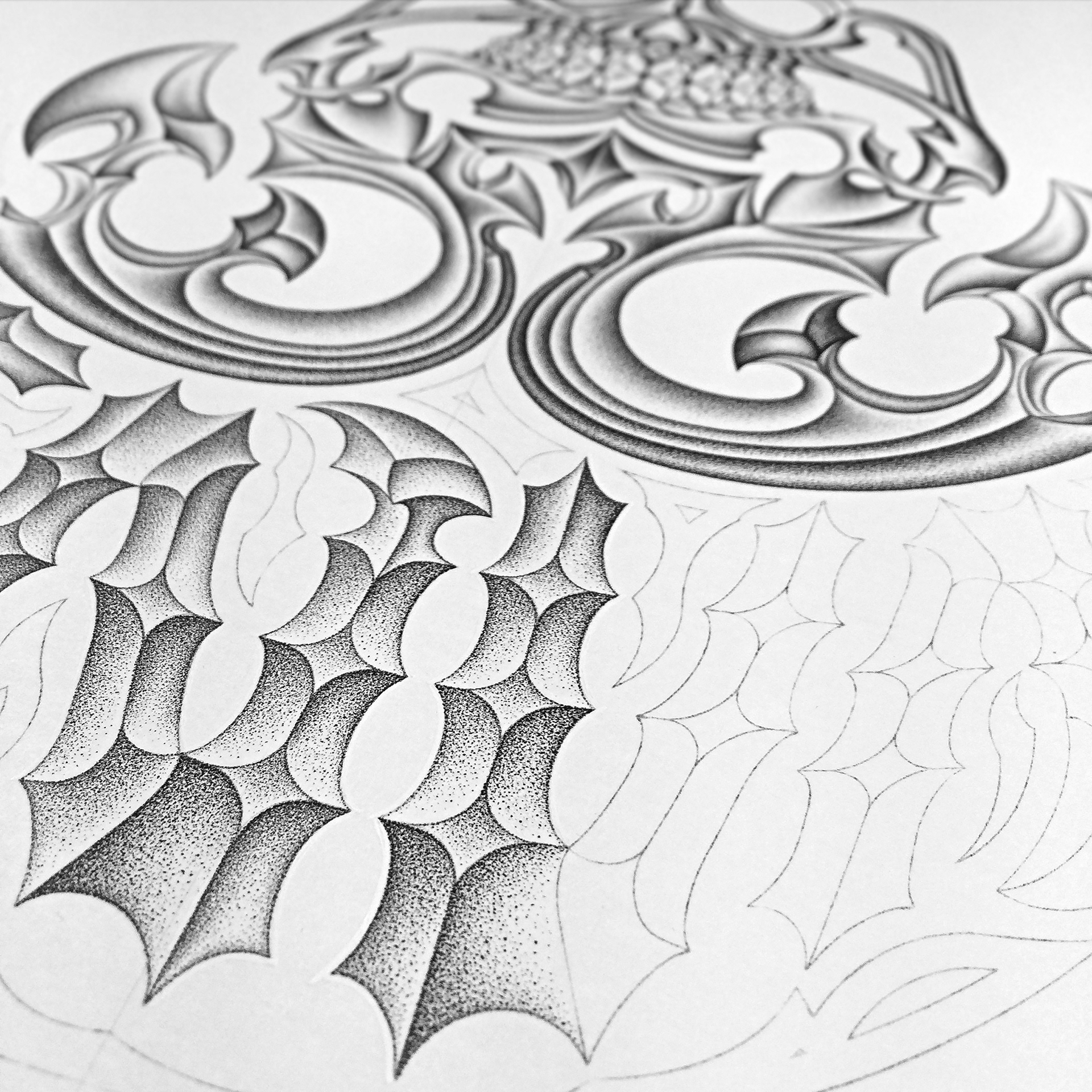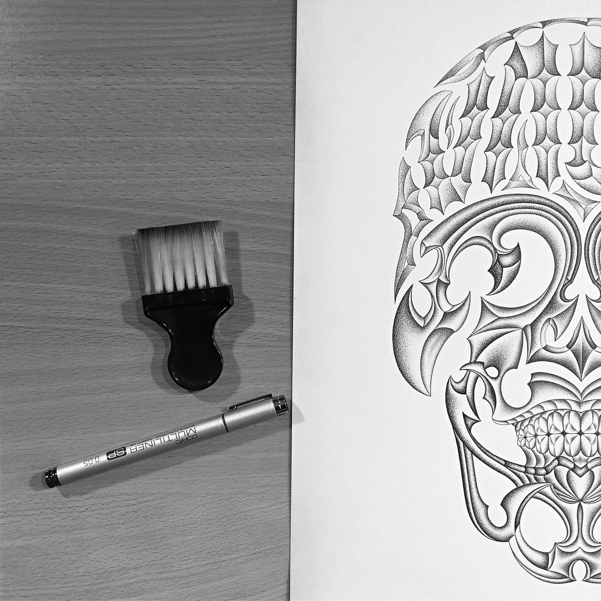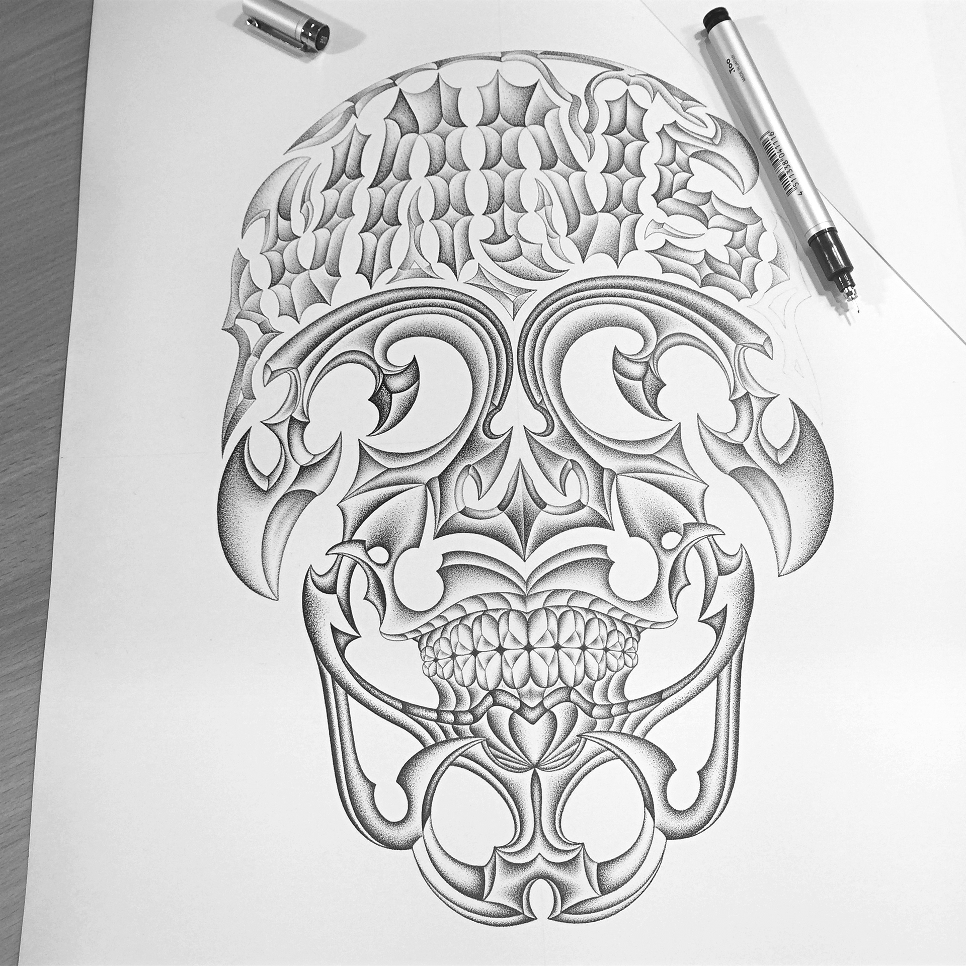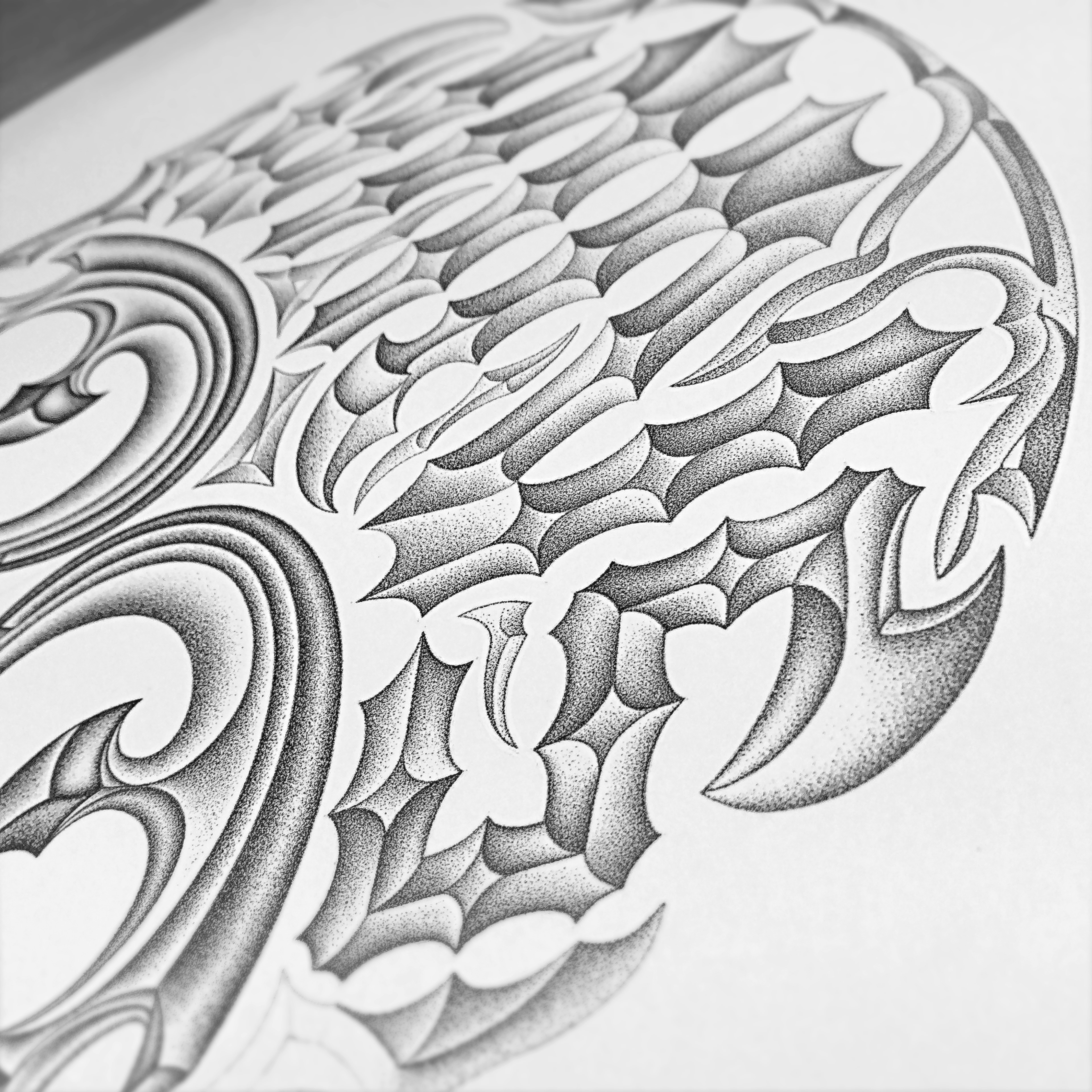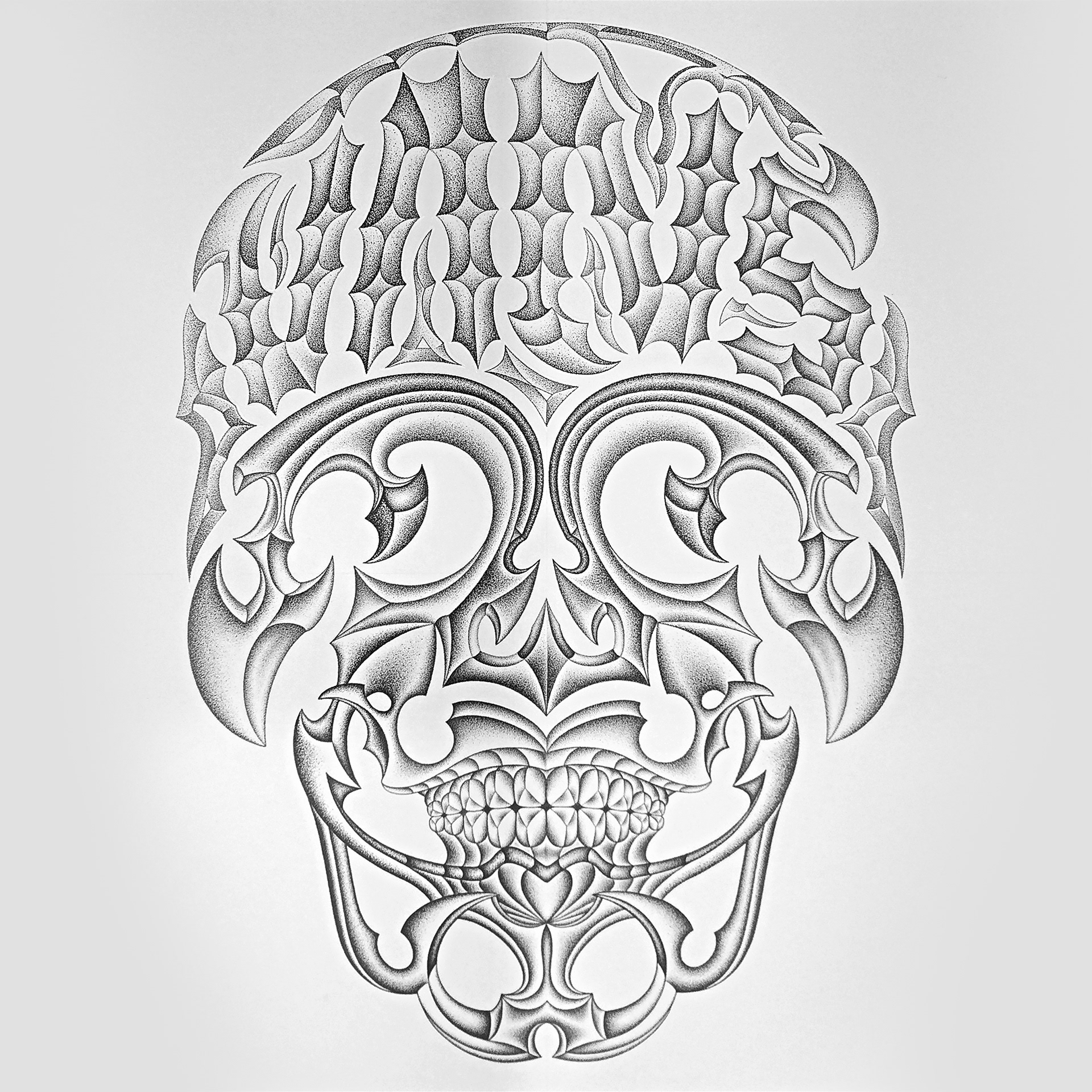


A typography prototype proposal. In this narrative, I wanted to draw attention to the process of planning, building and construction. My focus was on showcasing anatomy, formation and shape. A fine tip Rotring drafting pen was tooling for the "fill in" via a pointillism technique. I studiously worked toward finalising the decor and ornamentation in this style, inking one dot at a time. This medium has allowed for a specific calming of spirit and mind due to its lengthy process and production time. The "Vans" top rocker is a custom-designed typographical brand read and centrepiece for which all things revolve around, thus hopefully achieve a reasonable amount of fusion, balanced symmetry and organic contrast.
